Key Tips to improve mobile commerce

More than 90% of B2B buyers reporting a superior mobile experience say they are likely to buy again from the same vendor (compared with only about 50% of those reporting a poor mobile experience)
Google

What is Mobile Commerce?

Mobile commerce, also known as M-Commerce, is the buying and selling of goods through mobile devices such as smartphones and tablets. Essentially it specifically refers to eCommerce that occurs on smaller devices like mobile phones. Many of us use M-commerce on a daily basis be it through in-app purchases for games, marketplaces such as Amazon, or even financial services such as Revolut, Apple pay etc.

Why is Mobile Commerce Important?

As the prevalence of mobile devices, particularly smartphones, continues to rise, consumers are becoming more secure in using these devices for placing purchases through eCommerce channels. With digital wallets and banking companies popping up left and right, many users have begun to see and treat their smartphones as an extension of their physical wallet. 

Its importance is clear when combined with the rise of mobile-based users to websites, a recent report by Wolfgang digital revealed that mobile now accounts for a whopping 54% of revenue and 70% of traffic. It wasn’t too long ago that catering to mobile devices was a nice-to-have for websites, however, today it has become a necessity with many industry leaders designing for and focusing on mobile devices. And with over half of your revenue, and more than a third of your visitors coming from such devices, it is clear as to why mobile should be a priority for your eCommerce site.

The Challenges of Mobile Commerce

Mobile commerce offers increased flexibility to users and means that they can have eCommerce in their hands at all times. However, despite the opportunities that it offers, there are some challenges to designing and developing mobile commerce platforms.

Limitations of mobile devices

Despite the increased flexibility that mobile devices can provide to users, there are some limitations that come with them that desktop devices don’t necessarily have to deal with. The majority of mobile devices have limited display capabilities with smaller screen sizes, lower resolution, and restricted input options. These combined with some of the other technical limitations of mobile devices such as memory and disc capacity can result in the need for more minimal, less complex mobile apps and platforms. 
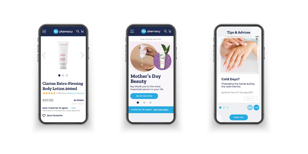
Small Screen Sizes

As mentioned above mobile devices have smaller screen sizes and such limit how much we can fit onto a screen. This limited space requires us to utilise smaller images, adjust text styles, and potentially add more pages of product listing and information. This can cause a conflict of interest between wanting to provide information for users, while wanting to keep the user journey simple and easy to navigate.
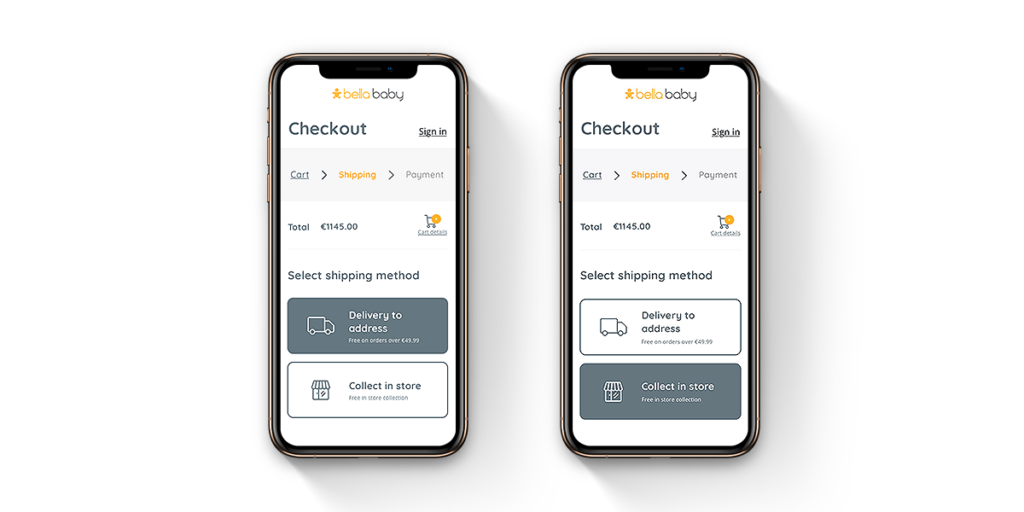
Payment Troubles 

With smaller screens comes smaller input fields, and keyboards. As such, there is an increased chance of users typing in errors. Many users also still hold concerns around the security of both purchasing over mobile devices, as well as saving their payment details on mobile devices. Some of these concerns surround the safety of online usage on mobile devices, whereas others surround the commonality of misplacing and having mobile devices stolen. As such, there is a greater need to dispel these concerns of users and reassure them that your platform is a safe place for their payment details.

The constant development of mobile devices

The mobile device industry is in constant development trying to outdo one another and create the fastest, most innovative smartphone and accessories. As such, operating systems, screen sizes, and hardware are constantly changing and evolving, meaning that there is a constant need to ensure that your eCommerce platform works on an ever-widening array of devices.

While there are these challenges and others with mobile commerce, ultimately it is where eCommerce users are going to, and as such we must cater to these users or lose out when our competitors do. Therefore, we have compiled our 5 top tips to improve your mobile commerce experience. 

Our 5 top tips to improve your mobile commerce experience.

Illustrate Security to Users

Mobile shopping is something that more people are getting used to now. Security and privacy around mobile eCommerce is a topic often discussed as some people feel more comfortable paying for goods on their computer rather than on their phone. Be sure to illustrate the aspects of your payment process that shows security at the checkout such as payment partners. Also building trust with users through detailed product information, customer support options and a reliable checkout process will convert users into repeat buyers.


Disable Auto-Correct During Checkout

This tip is based on the fact that many users will have home addresses, email addresses or names that aren’t in the dictionary and therefore using autocorrect in the checkout may cause a user to get frustrated while providing details and bounce off the website.


Use Descriptive Call to Actions

This is a very simplistic tip but is often not done well. Call to actions should be very clear in what they are going to do. Using “Buy Now” when a button should say “Add to Cart” provides the user with an inaccurate understanding of what is going to happen, therefore may cause confusion or frustration and in turn result in the shopper going off the site.


Provide a Pickup Option Next to Shipping Options (If possible)

Expectations for convenience are increasing for customers. The divide between online and physical retail is decreasing and users expect a seamless merging of these two worlds. If you have a retail or collection point as a business, be sure to make the most of it with eCommerce. Some users may find delivery charges or lead time if any, as a deal-breaker so having an option to collect may increase conversions online.


Focus on Ease of Use

Understand how users interact with their phone and place the relevant information and buttons in the right place to improve ease of use. As you can see in the image below, most users use their right hand when holding a phone while scrolling with their right thumb. With this in mind, here is an example – Placing buttons close to the bottom right corner, closest to the thumb, in the shopping experience to increase conversions to the cart.

If you want to learn more about M-Commerce, why not check out our blogs on eCommerce trends and PWAs. If you need help with your eCommerce platform then get in touch with our team at [email protected] or call us on +353 (0)1 4750066

With us you'll get customised digital solutions. B2B eCommerce expertise. eye-catching UX & design. streamlined on-boarding. a high-performance site. a long-term partnership. a thorough discovery. white-glove support. an amazing website. a team of experts.

Ready to transform your site?

Get in touch today!

EMPOWERING     INNOVATIVE     HUMBLE     SOLUTION-ORIENTED     EFFICIENT    HONEST     ARTISTIC     RESPONSIBLE     INNOVATIVE     CUSTOMER-CENTRIC     AWARD-WINNING   

EMPOWERING     INNOVATIVE     HUMBLE     SOLUTION-ORIENTED     EFFICIENT    HONEST     ARTISTIC     RESPONSIBLE     INNOVATIVE     CUSTOMER-CENTRIC     AWARD-WINNING