6 Tips to Optimise your Checkout

Checkouts are the make or break of your eCommerce platform. If your checkout is cumbersome or presents errors to your users they are highly likely to leave. As a result, most checkouts have a 70% abandonment rate. 

This checkout abandonment is more commonly referred to as shopping cart abandonment. But what exactly is shopping cart abandonment, I hear you ask. Well, shopping cart abandonment is the term used to describe when a potential customer begins the check out process on an eCommerce platform, only to drop out and leave the site before completing their purchase.
But not to worry, there are ways to reduce shopping cart abandonment and prevent your business from becoming a victim of this. You can easily increase your checkout conversion rate by adopting a few basic principles of best practice eCommerce design. 

Don’t gatekeep your checkout

The checkout seems like a great place to have users sign up and create an account. Unless you’re a B2B eCommerce platform, where accounts are important, users don’t want to have to create an account in order to place their purchase; and they will leave your checkout if you force them to do so. If you’re a B2C eCommerce platform, allow your users to complete their order using a guest checkout (you can still collect their email address through this) and then after their order is complete provide them the ability to create an account, and save their information for future purchases. By giving them the freedom to complete their purchase, and making it as painless as possible, users will be more likely to view your business in a positive light and therefore more likely to create an account. 

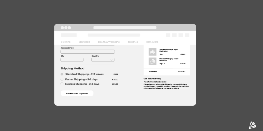
Emphasis shipping and returns, especially if they are free.

Do you offer free shipping and returns? If not consider doing so, at least above certain price ranges. If you do, then emphasise these policies. Make your users aware that they can return their purchase within 14 days, and ensure they know of any offers on delivery rates. While eCommerce use is on the rise, many users are still sceptical about many eCommerce sites, as they are taking a risk by placing an order. Your users can’t see, touch, or feel the product you’re selling so comforting them with good return and shipping policies will help to alleviate some of their worries. And from a business standpoint, most users don’t return items even if they know about your return policies, so highlighting them will have little impact on return rates; but may help to increase rates of purchases.

Returning to your shipping policies, try to provide users with multiple options. Some will want fast delivery and are willing to pay for it. However, others may be fine to wait a few weeks for their order if it means paying a lower price for their shipping. Given them the freedom to make their own decisions will positively impact their view of your business and prevent them from abandoning their cart because your shipping cost is too high for them. 

Offer relevant payment methods at the checkout

Every year it can feel like there is a new online payment method, while it can be difficult to tell which ones are more relevant than others it is important to ensure that you are allowing users to pay by their preferred method. This is even more crucial for B2B eCommerce sites, as payment methods will vary more compared to B2C eCommerce sites. Most eCommerce platforms allow users to pay through credit/debit cards and Paypal. However, preferred payment methods change depending on where your customers are based, for example, a payment provider called Boleto makes up 15% of online payments in Brazil. Know your users, and make payment provider decisions based on this knowledge. For example, if most of your users are from mobile devices, and IOS is the preferred software provider for mobile users, then adding apple pay may benefit your business. In contrast, it may not make sense to add apple pay to your platform if most of your users are either on android devices or coming from desktops. 

Focus on mobile optimisation

While it might sound a bit cliche to some, taking a mobile-first approach to the design and development of your site will ensure you are future-proofing your site. And yes, this includes the checkout. While it can be tempting to focus on the desktop, as site admins tend to view the desktop version of their site the majority of the time, your users are increasingly browsing and purchasing on mobile devices. In 2020, mobile users accounted for 70% of total eCommerce traffic and 54% of total revenue. By focusing on mobile-first you are ensuring that your checkout is usable from the off. If your checkout works on mobile devices then it is practically guaranteed to work on desktop devices, whereas, it often doesn’t work the other way around. And quite often what we consider to be eCommerce best practices tend to have mobile in mind, so following these should help to become mobile-friendly. The sites that are not responsive can appear outdated and untrustworthy to users. If your site doesn’t work well on their device, how can they trust you to keep them safe when making a payment?

Visualise the pathway

Most users don’t like surprises in their checkout flow, so don’t leave them in the dark. Visualise the checkout process so that users know where they are, and how long is left. Do they have to undergo 2 steps, 3 steps, 10 steps? If you don’t show them, how will they know? When it comes to the checkout process the fewer clicks a user has to do, the better. Ideally, everything would fit onto one page, however, we can’t always achieve this; especially on mobile devices. Plenty of studies have shown that conversion rates of checkouts increase with the fewer clicks needed to complete a purchase. But when you need to spread out the checkout flow, visualising these stages, and the progress of the user will help to keep your conversion rates steady.

Be transparent

In a similar vein to the previous point, users like to see the final price before committing to lengthy checkout flows. By showcasing the final price (or an estimate of it until you can accurately show it) and being transparent with the breakdown of it, users’ trust in your brand will increase. This feature is becoming more popular amongst eCommerce sites in an attempt to prevent orders from being abandoned due to the perception of price increases in the guise of handling or tax fees. We have all been there where the price shoots up due to the addition of multiple hidden costs, and many of us have abandoned those purchases and not returned to complete them.


By adopting these basic principles within your B2B or B2C eCommerce site’s checkout (although some of them shouldn’t just be limited to this section), you can optimise your checkout experience, cut your cart abandonment rate and thus increase your overall conversion rates. 

Need help applying these principles to your eCommerce platform? Well, get in touch with our team of experts who will be more than happy to help. You can get in touch with us at [email protected] or calling us on +353 (0)1 4750066

With us you'll get customised digital solutions. B2B eCommerce expertise. eye-catching UX & design. streamlined on-boarding. a high-performance site. a long-term partnership. a thorough discovery. white-glove support. an amazing website. a team of experts.

Ready to transform your site?

Get in touch today!

EMPOWERING     INNOVATIVE     HUMBLE     SOLUTION-ORIENTED     EFFICIENT    HONEST     ARTISTIC     RESPONSIBLE     INNOVATIVE     CUSTOMER-CENTRIC     AWARD-WINNING   

EMPOWERING     INNOVATIVE     HUMBLE     SOLUTION-ORIENTED     EFFICIENT    HONEST     ARTISTIC     RESPONSIBLE     INNOVATIVE     CUSTOMER-CENTRIC     AWARD-WINNING