Get your eCommerce site UX ready for Black Friday & Holiday Sales

With Black Friday, Cyber Monday, and the Christmas holiday period on the horizon, many businesses are planning their sales and getting themselves organised for a busy period. And with COVID-19 going nowhere any time soon, more shoppers than usual will be using eCommerce platforms to purchase their products over physical stores. With this in mind, it is now more important than ever to get your eCommerce site sale ready. Many eCommerce sites, both B2B and B2C, make the same common mistakes. Below I will take you through 5 common pitfalls and suggest ways in which you can avoid or resolve these problems. 
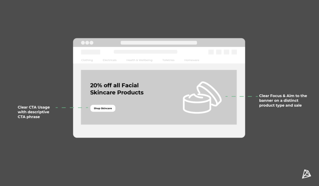
Value Proposition

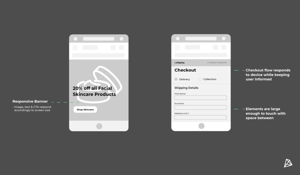
It is important that every section on your eCommerce site holds value and helps to either drive sales or conversions. Each page, and the elements within it, should contribute towards this goal. And quite often, sites fail to ensure this in a number of different ways. However, there tends to be one consistent culprit of this. And what is it? It’s banner images. Banner images are often not utilised properly with two main issues that occur; these are unclear messaging, and no clear Call To Actions (CTAs). Without giving users CTAs and a clear focus you are creating an obstacle between your users and your products. For Black Friday, Cyber Monday, and the holiday sale period you will likely want to utilise these banner areas for highlighting your sale options. By placing the focus of these banners on featured products and/or discounts, businesses can increase their conversion rates. This is due to there being a clear aim and target for the users in contrast to using generic more brand-focused banners. 

Create a consistent, unified design approach

The hierarchy of your page matters and one of the best ways to define this hierarchy is through your use of styling, specifically in terms of how you use typography. By having a defined style and keeping it consistent throughout the site users are presented with a consistent brand image which helps lead to a smoother user experience, and they are also less likely to encounter issues. Through introducing a more comprehensive typographic hierarchy, there will be a clear separation between sections, users will be guided easier, and it allows for emphasis to be put onto the main aim of the page. This in short means that when you are highlighting items that are on sale during this period on sale, it will be easier to do as there will be less clutter due to the consistency of the site’s design.

Keep it interactive

While it may seem simple at first glance, it is often an overlooked aspect of eCommerce sites. The use of interactive elements such as hover effects, (yes this even includes basic effects such as shadows and underlines) can positively increase a user’s experience on a site, and can also provide an opportunity for you as a brand to express yourself and showcase your personality. It is important to remember every brand has a personality, no matter how serious or professional you may position yourself. The addition of these elements will also help to explain to users what elements are clickable and which are not. While I mentioned in my first tip that it is important to provide value to users through your elements such as banner images, it is also important to inform them (through these interactive elements) that there is value to be found once they explore more.

Error Prevention in the cart

Congrats, you got your user to the cart page, but this is where it could all go wrong. Regardless of how great your Black Friday or Holiday discount is, one issue or error is enough to stop your user in their tracks and have them abandon their cart. A survey of 450 top European eCommerce websites discovered that 58% of their checkouts had at least 3 basic errors. Yes at least 3… Think of all the revenue these companies have lost from users being frustrated or confused and thus leaving the site. It is beyond important that you ensure that your users can easily understand the different delivery options you offer, that they are kept informed of where they are in the payment process, that returning users can have their information saved, amongst many other elements. However, these all have one key factor in them. And that’s the use of clear labels and descriptions. By clearly labelling and describing the different input fields and sections, users are kept informed of where they are and what they are to do. As a result, users are far less likely to make mistakes and get frustrated. By being clear and transparent with your users it is far more likely they will complete their purchase and thus increase your conversions.

Mobile Experience

Mobile is no longer the future of eCommerce, it is the present. Yet many sites fail to ensure that they continue their user experience across mobile devices, ensuring that elements such as banner images are responsive. Quite often the interactive elements implemented are not done so with mobile in mind. As a result, mobile users are unable to click into a product or add it to their cart… yes, many ill-implemented interactive elements get in the way of conversions. By considering mobile when designing elements first, and smoothing out the user journey for mobile users we can resolve many of the major problems straight off the bat. This is also important if your company plans to do social media marketing for your Black Friday or holiday sale, as most of those users will be on mobile devices when they view and hopefully click onto your ads. If you are targeting them on platforms that they are likely to view through mobile devices, then you need to ensure that your eCommerce platform works for those devices and is responsive.

By implementing improvements in these 5 areas, you can greatly improve your user experience, and keep your users happy. And happy users become regular users. If you’re still at a loss as to how to improve your B2B or B2C eCommerce experience, our design team would be more than happy to help. You can learn more about all of the different services our design team offers here.

Or if your eCommerce site is old, or non-existence, and you need a solution to get yourself trading online fast, then check out our Magento 2 accelerator solution apex here.

If you still have any questions or want to get in touch with us you can do so by calling +44 (0)203 4115549 or email us at [email protected] 

With us you'll get customised digital solutions. B2B eCommerce expertise. eye-catching UX & design. streamlined on-boarding. a high-performance site. a long-term partnership. a thorough discovery. white-glove support. an amazing website. a team of experts.

Ready to transform your site?

Get in touch today!

EMPOWERING     INNOVATIVE     HUMBLE     SOLUTION-ORIENTED     EFFICIENT    HONEST     ARTISTIC     RESPONSIBLE     INNOVATIVE     CUSTOMER-CENTRIC     AWARD-WINNING   

EMPOWERING     INNOVATIVE     HUMBLE     SOLUTION-ORIENTED     EFFICIENT    HONEST     ARTISTIC     RESPONSIBLE     INNOVATIVE     CUSTOMER-CENTRIC     AWARD-WINNING